


My brothers and I came up with a symbol for our family. A family crest of a sort. It's not like the English crests, which are heraldic; Instead it's a symbolic graphical representation of things that are important to us.
These are some pictures of the projects involving the crest. Not included is Technobane, which has it's own photojournal page.
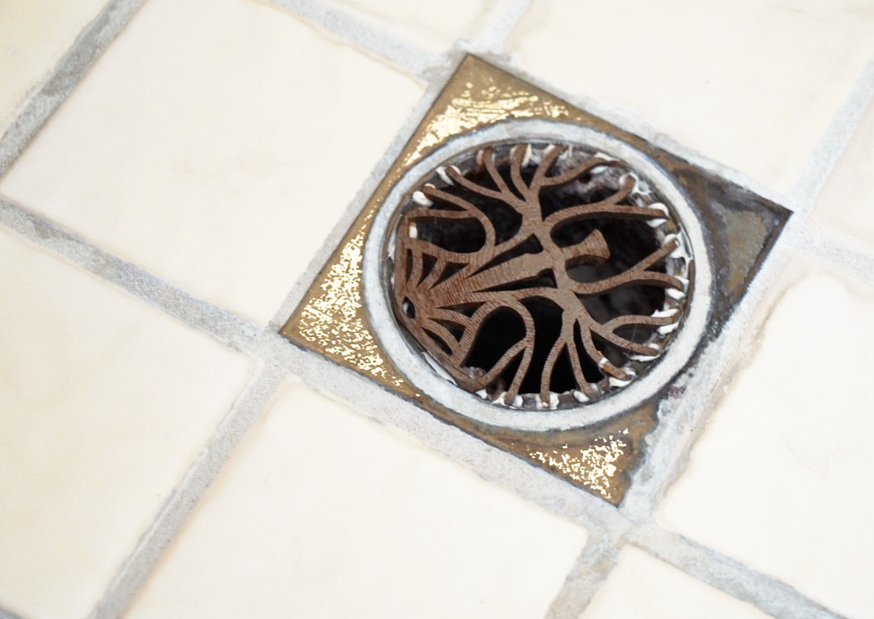
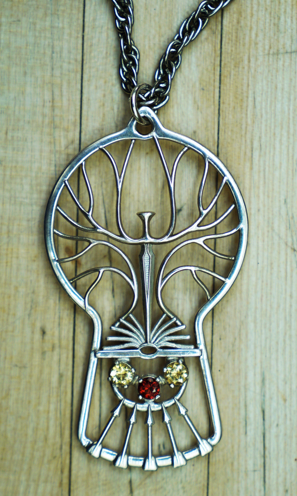
The crest is strongly biblical in its references. The tree of life, the sword of the Spirit, and the Bible make up the top portion. Below the line are five arrows and three stars, representing the five boys and three girls (my siblings) in my father's family.
I occasionally do handyman work along with other physical products. If you'd like to commission a custom build, I can help you with that.
Tree Drain. A drain cover in the form of the family crest. The old drain covers were really worn out. So worn that they were broken. I even pinched myself on it once!
So I made some new ones, in the form of the family crest! Much more sturdy.
I guess you could say our family is all about preventing things from going down the drain.
New Spooner Crest Pendant. Since the old crest didn't turn out quite right, I updated it and presented this version to my mother for Christmas, 2016.
New Spooner Crest Pendant Back. The ears on either side allow the pendant to also act as a brooch when used with a straight pin.
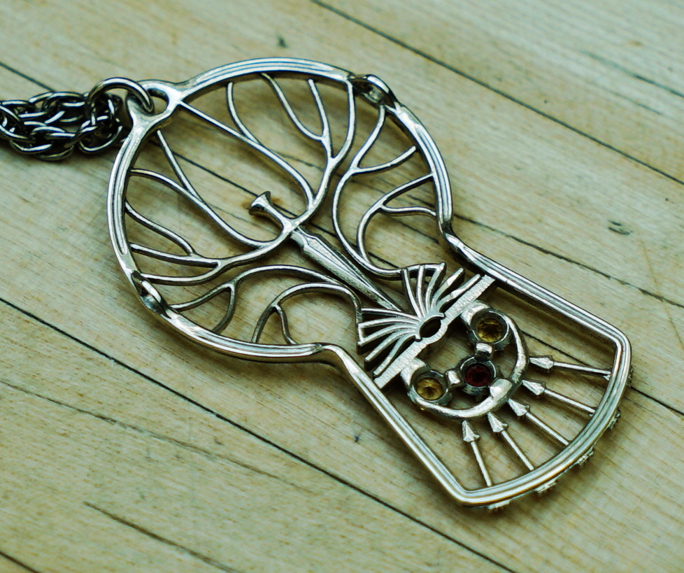
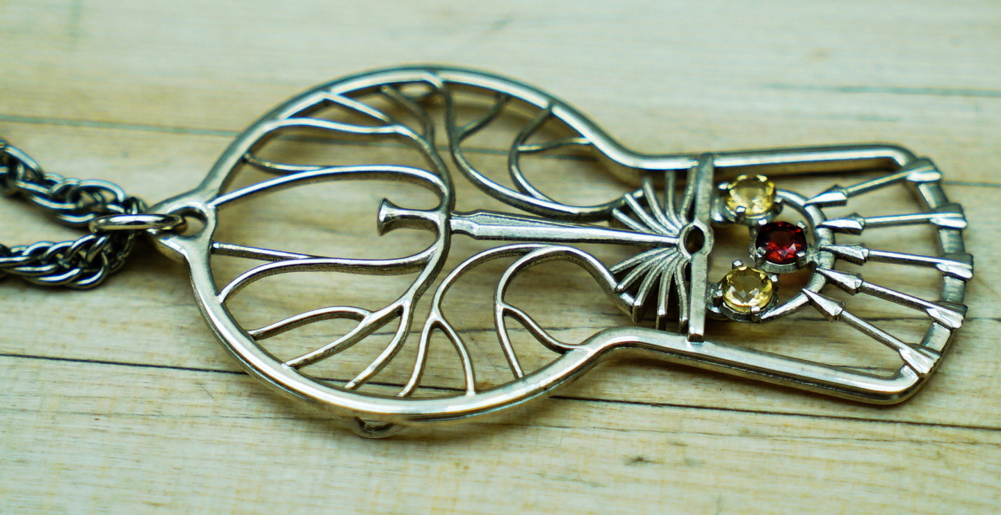
New Spooner Crest Pendant Side. This version has quite a bit more dimensionality than the old version. It's quite striking how different the feel is with even the minor added depth.
Crest Paul Spooner. Tried out a bunch of things, but ended up pretty close to my dad's. Elements are book/fountain, tree, hammer, cross, gears. Hoping to take another pass at it some day, but so far that day has not come.
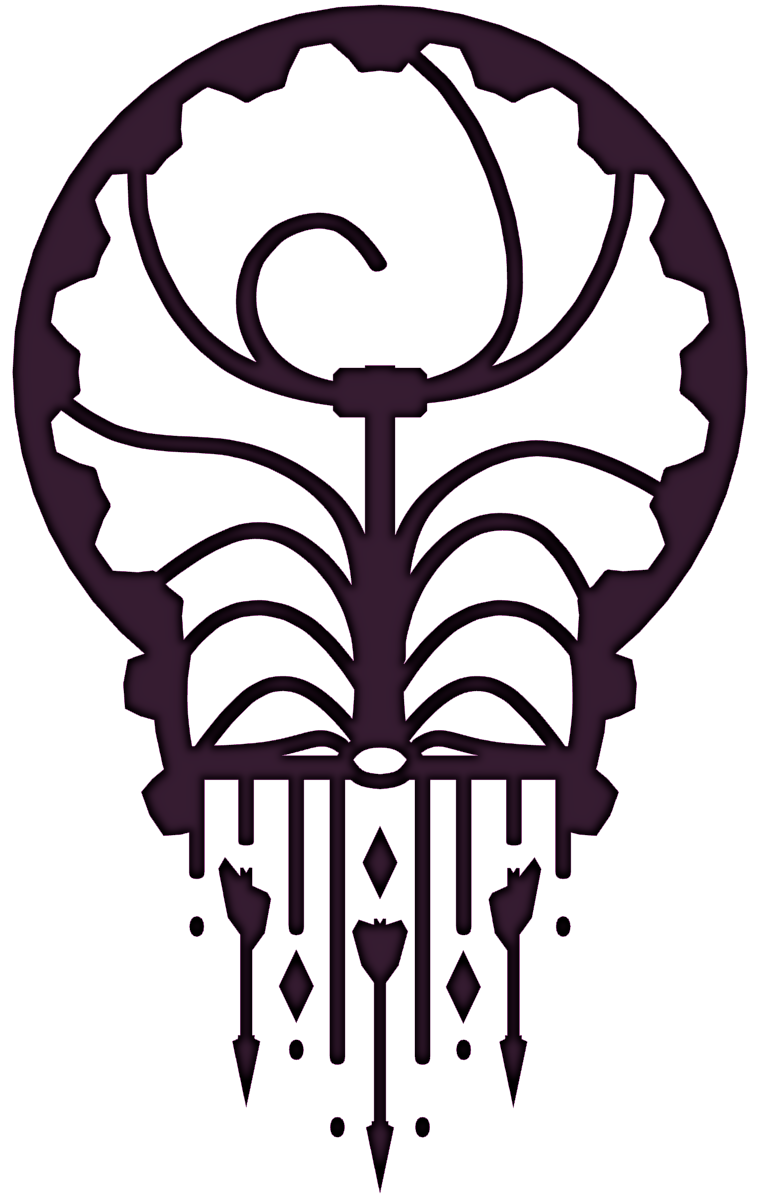
Crest Ron Spooner. My brothers, parents, and I came up with this family crest.
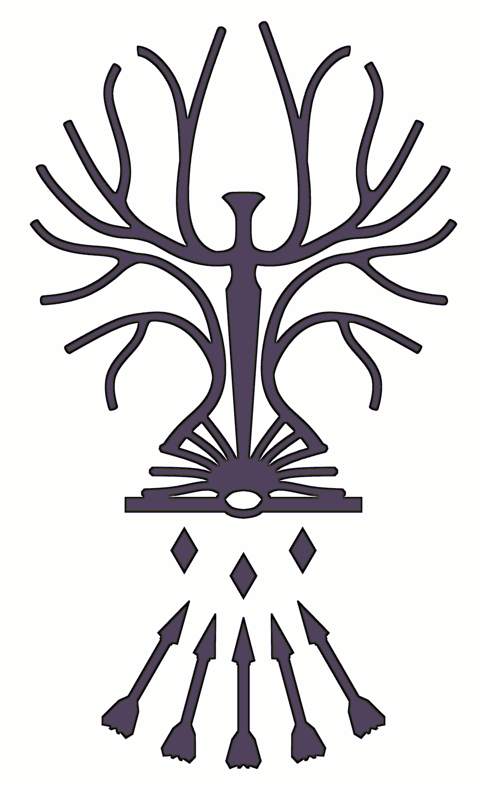
It is intended to be rich in Symbolism, specifically as follows:
The tree stands for the spirit. Many parts, unified in one. Growing, flexible, but always the same.
The sword stands for the soul. Judging and discerning between right and wrong. Justice, quickly excercised.
The book stands for the body, and truth. All reality is founded on truth, and truth is reality. Without the body, the rest of the parts have no basis.
The arrows stand for war and death. Fundamentally, we are at war, all the time, day and night. The very cover of the book of reality is that of war and suffering and death. Conversely, our death is Christ is the foundation for all we can hope to accomplish, and the source of all earthly joy.
The arrows also correspond to Ron's sons, and the diamonds to his daughters.
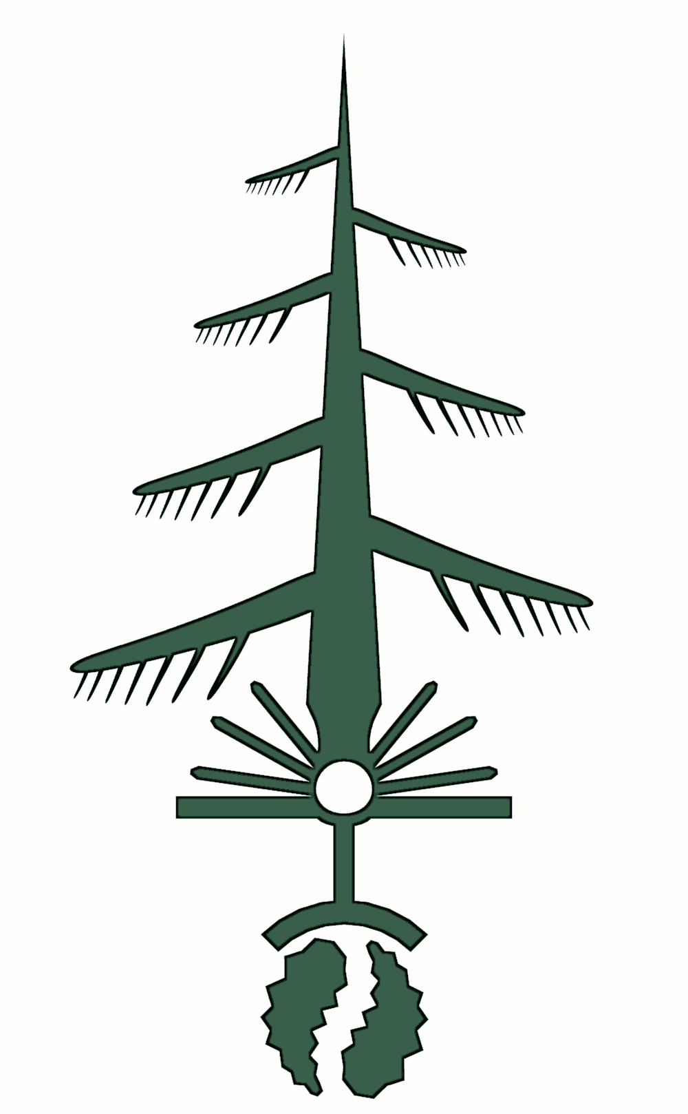
Crest Ben Spooner. My brother Ben wanted his own crest. The squiggly things at the bottom are Jack-pine pinecones.
The book has become a rising/setting sun.
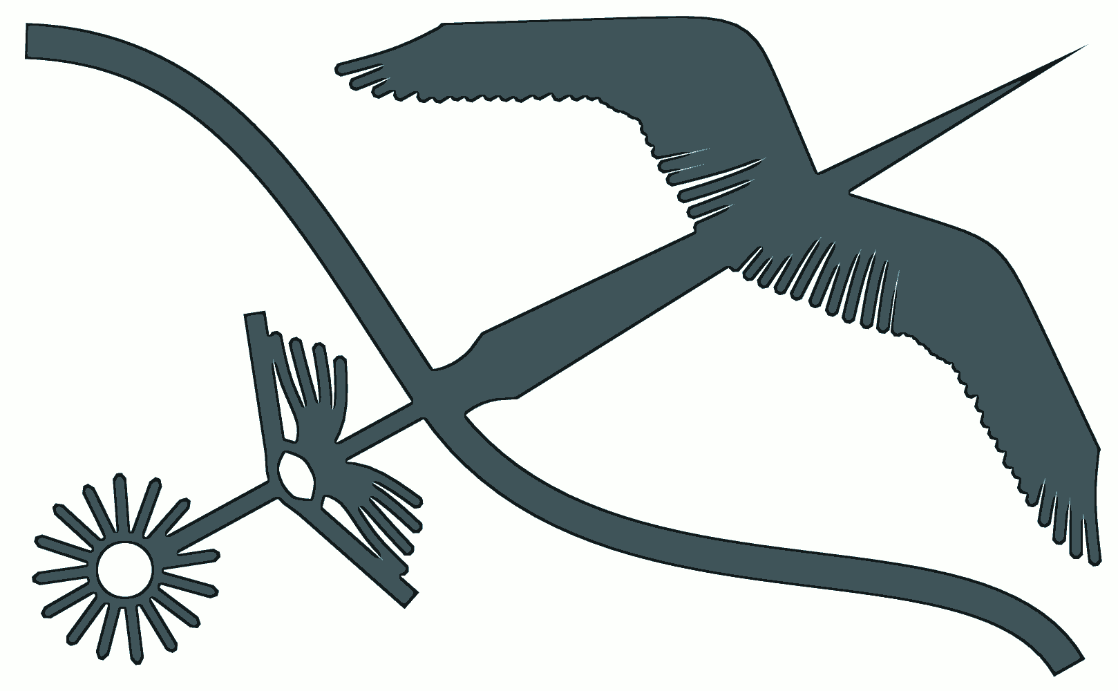
Crest Luke Spooner. My brother Luke wanted his own crest. The elements are the Sun, book, river, sword, and wings.
Spooner Crest Necklace Front. Here's the whole Spooner Family Crest, in neckalce form. It's about an inch wide, to give you a feel for the scale. The sword is supposed to reach all the way down to the center of the book, but it didn't quite make it through the casting process.
The diamond shapes for the girls have been replaced by their birthstones in this incarnation. They were mounted (after casting of course) by bending over three posts next to each. That part actually worked very well, and I didn't have any of the problems that I had expected.
I had this printed in sterling silver by Shapeways.com during the silver trial run. It was a test for them, and a test for me too, as this is the first 3D printed object I've ordered. I'm fairly impressed with the quality of the work that Shapeways did on this. The polished finish is very good, and the detail is (except for the sword, and some of the letters on the back) perfect! In the future I'll be more careful to respect the "smallest feature size" limit.
I gave this necklace to my mother for Christmas, 2010.
Spooner Crest Necklace Back. Here you can (barely) see the words written around the edge of the pendant. They are (or should be):
"LIKE A TREE LIKE ARROWS LIKE A SHARP DOUBLE EDGED SWORD LIKE STARS FOREVER"
You can also see the 3D printing artifacts more clearly on this side. The front was polished, but the back wasn't. You can see that words didn't come out very well. I should have made the edge a bit thicker, and the letters larger, as they are pushing the smallest feature size. Alas. Perhaps some day I'll clean them out and engrave the missing parts of "forever" at the top.
Spooner Crest Necklace Perspective. Another picture of the necklace, showing a bit more of the structure. The branches and arrows are thicker than they are wide, allowing them to appear thin from the front, but still be strong enough to stand up as jewelry.
You can see the printing lines clearly here on the right side of the book. It was printed in wax, and then cast in silver by the good people at Shapeways.com